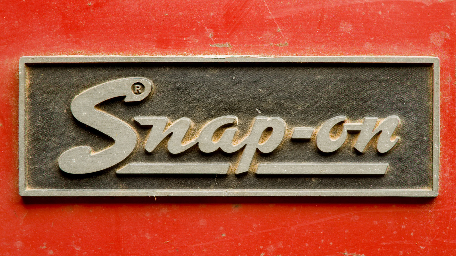
Snap-on, a prominent name in the tool industry, has seen its logo evolve significantly over more than a century. Established in 1920, the company originally focused on creating five hand tools that could perform the functions of fifty, revolutionizing the automotive repair landscape. As Snap-on advanced, its logo reflected the brand’s growth and commitment to quality.
The first logo, a simple red underlined script, served the company from its inception until 1944. This design became emblematic of Snap-on’s reputation for durable, high-quality tools, a legacy that persists today. Even tools from this era remain functional, showcasing the craftsmanship of Snap-on products.
In 1944, the brand introduced a new logo featuring an italic script in white against a red background. This change came during a pivotal time, as Snap-on had proven its worth in the war effort, and the durability of its tools had improved with the use of nickel alloy steel in response to military needs. This logo was short-lived, lasting only until 1948, when the company adopted yet another design.
The logo of 1948 embraced a bold, playful font that reflected the trends of the 1950s. It was designed to capture attention in advertisements, featuring the name in white on a solid red background. By 1953, a significant shift occurred as Snap-on reversed the colors, presenting red text on a white background. Notably, this iteration included “Tools” in the design, marking the first time the word appeared in the logo.
This logo remained in use until 1981, when Snap-on streamlined its branding, introducing a design that closely resembles the current logo. A distinctive feature of this version was a wrench-shaped cutout in the letter “S,” a playful nod to the brand’s identity. The colors were flipped once again, maintaining the boldness of the design while ensuring easy recognition.
In 1995, Snap-on unveiled its final logo iteration, characterized by a blockier appearance while retaining elements from its earlier designs. This evolution reflects the company’s commitment to quality and innovation over the last century.
Today, Snap-on tools are synonymous with reliability and performance, justifying their premium prices. The company’s rich history and dedication to crafting durable tools are evident not only in its evolving logo but also in the enduring functionality of tools produced throughout its long history.


