Farrow & Ball’s paint color Dimity has emerged as a top choice for homeowners seeking a warm neutral shade. Its popularity stems from its versatility and ability to create calming spaces across various room styles. Many users, including interior designers and homeowners, have embraced Dimity for its unique characteristics, leading to its application in multiple areas of their homes.
The allure of Dimity lies in its subtle red undertones, which provide a warmth often missing in other neutral paints. Unlike shades that can veer too much toward pink, yellow, or gray, Dimity maintains a balanced tone, making it suitable for various lighting conditions. Patrick O’Donnell, brand ambassador at Farrow & Ball, notes that the color’s red hue makes it particularly effective in poorly lit spaces, enhancing the room’s overall feel without overwhelming it.
Dimity’s Versatility Across Different Spaces
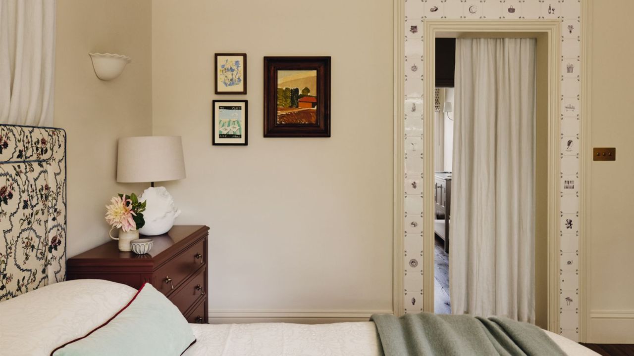
In practical applications, Dimity has been used in diverse settings, demonstrating its adaptability. One homeowner shared their experience of using Dimity in four different rooms, noting how it has become a cohesive element throughout their home. They found that the color does not require perfect lighting to look appealing. In their east-facing main bedroom, for example, the warm tones of Dimity harmonized beautifully with bolder choices in decor, such as a burgundy striped headboard and wine-red wardrobes.
Interior designer Emma Ainscough also praises Dimity, having applied it in the master bedroom of a Victorian house. The color complemented rich, dark furniture while providing a calming backdrop. Ainscough’s choice reflects a broader trend where designers utilize Dimity to create serene environments that feel both traditional and contemporary.
Moreover, Dimity has found a place in bathrooms and other areas where a softer touch is preferred. In a colorful Victorian property in London, designer Eadie & Crole selected Dimity to cover beadboard paneling, achieving a tranquil atmosphere. This versatility makes Dimity an appealing choice for various design schemes, whether in historic or modern homes.
Expert Opinions on Dimity’s Enduring Appeal
Many professionals in the interior design field have embraced Dimity for its reliability and timeless quality. Designer Cindy McKay states, “I find Farrow & Ball’s Dimity to be such a timeless color. It gives a wonderful, warm, and cozy feeling to a space without it being too yellow or beige.” This sentiment echoes the experiences of many who have used Dimity, emphasizing its ability to work seamlessly with changing light and bolder color patterns.
The paint’s finish also significantly impacts its appearance. In guest bedrooms and living areas, Dimity has been paired with various wallpapers and trim styles, showcasing its adaptability across different textures and styles. This ability to blend with both contemporary and classic designs further solidifies its status as a preferred neutral shade.
For homeowners and designers looking to create soft, calming environments, Dimity stands out as a reliable choice. Its subtle warmth makes it a versatile backdrop for any color scheme, allowing for a harmonious blend of styles without demanding attention. After extensive use in various settings, Dimity remains a favored option for those aiming to achieve a sophisticated yet inviting atmosphere in their homes.
As the trend towards warm neutrals continues, Farrow & Ball’s Dimity is likely to remain a staple in interior design. Its unique qualities ensure that it will appeal to a wide range of tastes, making it a timeless addition to any space.