Farrow & Ball’s blue paint shade, known as Yonder, has gained significant attention for its unique quality and versatility in interior design. As a contemporary interpretation of blue, Yonder stands out with its bright yet soothing tone, proving to be a favorite among designers and homeowners alike.
Yonder is described by Patrick O’Donnell, brand ambassador at Farrow & Ball, as “the crispest and freshest of our light blues.” He notes that the shade captures the essence of morning coastal skies in the northern hemisphere. The paint contains a hint of black, which prevents it from appearing overly stark or clean. This thoughtful design allows Yonder to thrive in various lighting conditions, particularly in south-facing spaces where it exudes an “endlessly optimistic and joyful” atmosphere.
The color’s adaptability makes it an appealing choice for multiple areas within a home. O’Donnell suggests its suitability for guest bedrooms, children’s rooms, and even cabinetry in bright kitchens, thanks to its warm undertones that keep it from feeling too cold.
Creative Ways to Use Yonder in Interior Design
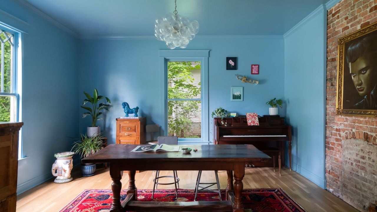
Designers have been quick to showcase the many ways to incorporate Yonder into a home. For instance, Kristin Bock from Bock Building Co. chose Yonder to color-drench her parlor, creating a vibrant backdrop for her decor. Bock explains, “The centerpiece of this room is my beloved Velvet Elvis,” which inspired her choice of blue. She appreciates how Yonder strikes a balance between cool and warm tones, making it an uplifting element in the space.
In a similar vein, Lucy Williams, an interior content creator, utilized Yonder in her living room, combining it with warm woods and rich textiles. The result is a snug, inviting environment that challenges conventional ideas about using bold colors in living spaces. Williams highlights that the depth of Yonder allows for a dynamic visual experience throughout the day, adapting beautifully from bright daylight to the soft glow of candlelight.
Yonder’s Versatility and Timeless Appeal
The charm of Yonder extends to children’s rooms, where it can be paired with vibrant accents to create a cheerful atmosphere. Sarah Southwell of Sarah Southwell Design emphasizes Yonder’s ability to bring a “joyful lift” to any space, particularly in a child’s nook. Its playful warmth brightens rooms, fostering a welcoming ambiance.
Moreover, Yonder can also serve as an accent color, lending itself well to woodwork and cabinetry. Southwell suggests that when used alongside soft, earthy neutrals, Yonder transforms from a playful hue to a timeless statement. For a cohesive look, O’Donnell advises pairing Yonder with clean whites or deeper shades like brown to enhance its livability.
As Yonder continues to capture the attention of designers and homeowners, it emerges as a color that transcends fleeting trends. Its unique characteristics and versatility suggest that it may become a lasting favorite in the world of interior design. From cozy living rooms to vibrant children’s spaces, Yonder’s adaptability and warmth promise enduring appeal.
With its ability to bring personality and joy into any setting, it appears that Farrow & Ball’s Yonder is not just a passing trend but a strong contender for timelessness in home decor.